Role: UX Designer
Timeline: 1 week
Mobile Platform: iOS + Android
Box Office Tycoon (BOT) is a mobile idle game where players are able to grow their theatre through the accumulation of in-game currency, even while offline!
My Role
I was the only UX Designer and UX Researcher for this project.
At the start of the game development, the team didn't have a designated UX Designer. However, when they realized the engagement with the managers's system (a component of the game) was not meeting the Key Performance Indicator (KPI), they reached out to me to help bring the engagement numbers up.
Game Mechanic
Managers help players grow their theatre faster!
The Problem
Data showed a lack of manager engagement in BOT version 0.3.
● ❌Players were not hiring managers.
● ❌Players were not assigning managers to the proper stations.
● ❌Players were not boosting managers' special abilities.
Why is this bad?
● The less players engage with the managers, the slower their pace within the game will be.
● The slower the pace of the game is, the higher the churn rates will be.
● If players do not use the managers, it will affect monetization (premium sinks).
● Since the players are not assigning managers to the right stations, it shows that there is a communication issue with the design of the manager system.
The Goal
How might we make the manager system understandable so that players will engage with the managers more for BOT version 0.4 release?
We did not have a KPI that we were aiming for on the engagement with the managers. We simply wanted to improve the design of the manager system.
User Flow + User Story
I analyzed the user flow to understand the pain points.
The pain points below were based off an internal usability test that was conducted in the office.
I converted the pain points into user stories.
This method allows me to place myself into the users' perspective, reduce feature creep-ins and prioritize the pain points to understand which problem to solve first.
This method allows me to place myself into the users' perspective, reduce feature creep-ins and prioritize the pain points to understand which problem to solve first.
Here are the user stories I created:
1. As a player, I want to remember which icons are for which station, so that I will be able to easily match my manager preferences to the right station.
1. As a player, I want to remember which icons are for which station, so that I will be able to easily match my manager preferences to the right station.
2. As a player, I want to understand the purpose of the managers' preferences, so that I will be able to see the value of matching my manager to the right station.
3. As a player, I want to easily notice if I've assigned a manager or not to the station, so that I will not go into the gameplay thinking that I did assign one.
4. As a player, I want to notice where I have correctly matched my manager to the right station, so that I be getting the maximum boost for that station.
5. As a player, I want to notice when I have/haven not clicked the start button to active my manager's special boost, so that I be getting the maximum boost for that station.
The user stories are listed out in the order of the pain points that had shown up first from the user flow. From all these different user stories, I looked to see which one was the most important to fix first and chose to change the icons so that it would be more understandable to the users first. The reason I did that was because it was the lowest hanging fruit, especially since the mobile gaming industry is very fast paced with lots of sprints, it was important to tackle the lower hanging fruits first. (However, I will not be focusing on speaking about my process of that for now, if you want to know how I've solved that problem, please scroll to the end of the page)
For this case study, I will be focusing on my redesign of the managers' system.
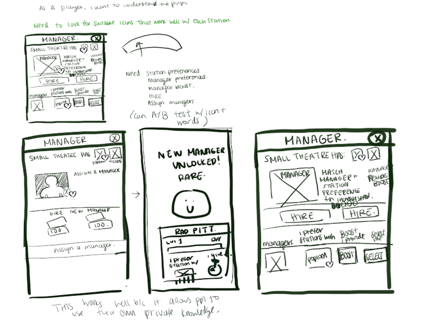
Ideate + Sketch
I brainstormed using Crazy 8's technique.
I began sketching my ideas based on hearts as a communicator of managers' need to be matched to a station they like.


Design + User Testing
I brought my sketches to Sketch and began designing. Between my iterations, I user tested with people in the company.
It was important to user test with people inside the company, so that I would be able to understand whether or not my designs were understandable. I always made sure to user test on people who were not within the game teams, such as the marketing team, data analyst, I.T., because they were the most far removed from the games.
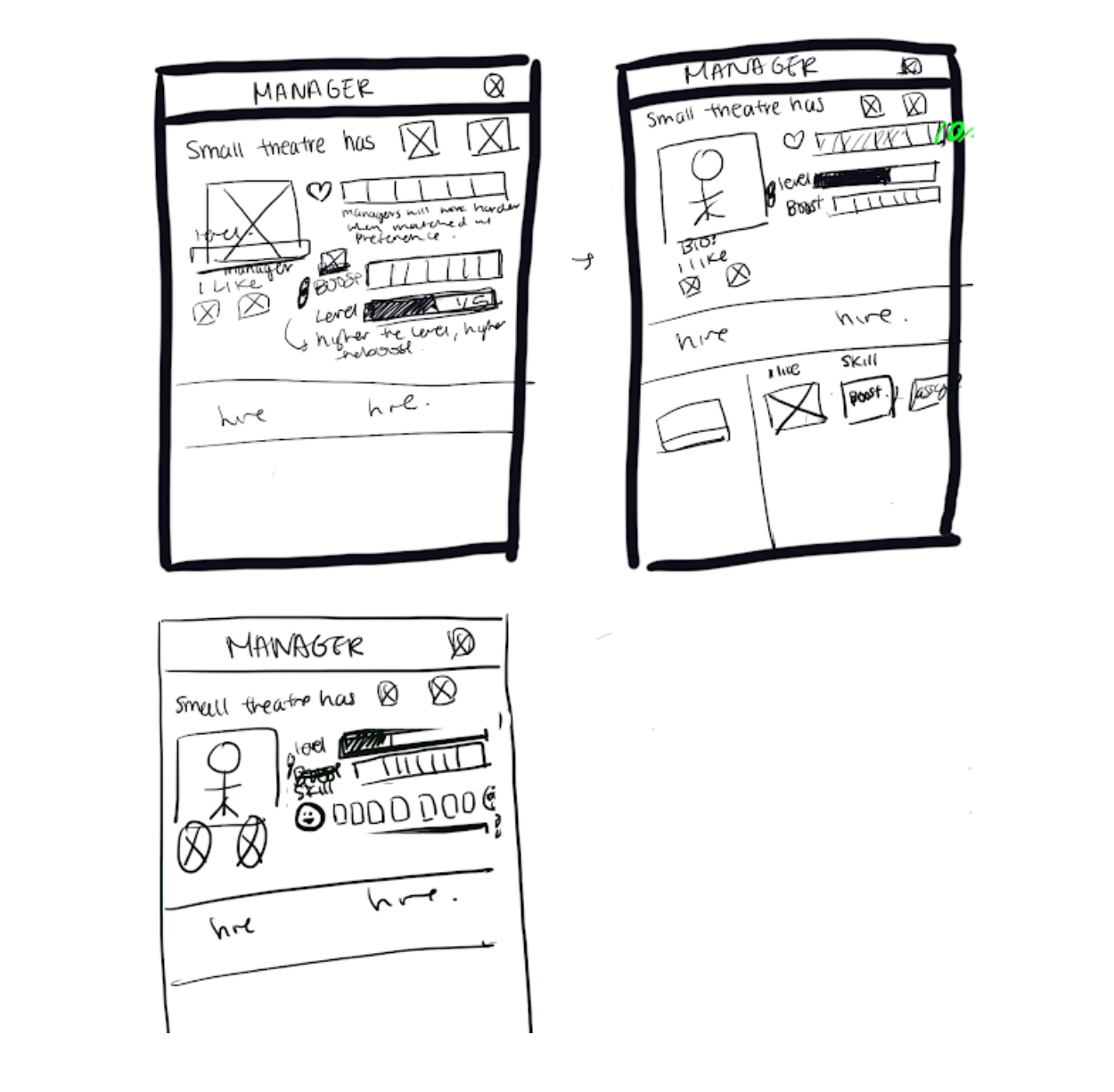
Below you will see my reiterations and how I got to my final solution. I divided the screen into 2 halves for easier communication.
First half of the screen:
First half of the screen:
Second half of the screen:
UI Design
After I've finished the mockups, I would send them to the UI designer to review and correspond.
At our company, UX and UI are separated. I create a slack channel between the UI designer, game designer and I. From there, if there's any UI constraints, I would give my thoughts on how to work around it. It helps having the game designer onboard in the Slack channel, because he understands the functionality constraints.
By having more eyes to look over the new screens being developed, it helps create a better game.
The Impact
The design solution helped bring up manager engagement.
● ✅ Players who engage with the managers to begin with (assigning and boosting) has doubled from 0.3
● ✅ 0.4 reduced users who don’t engage with manager boosts at all by ~30%
● 😐 Many players are still not hiring/boosting on Day 0- 2
User Research + Moving Forward
I conducted research to understand why players were still not hiring/boosting on Day 0-2.
● ✅ What we've learned is players do understand the managers system
● 😐 Players don't see the value of the managers until Day 3, and that is because the game is too heavily focused on unlocking and upgrading station and items on Day 0-2.
● 😐 Players felt that the VIP and offline ads provide more immediate cash than boosting managers' abilities that last for ~5mins until they need to reactivate the boost.
What did we learn?
● We learned that users have simple focuses early on.
● It's important to look even earlier on in the user flow.
What came next?
● We put managers into the goals.
● We badged stations that didn't have managers.
What I learned
Design is a marathon, not a sprint.
● It's easy to get caught up in wanting the best product by a certain date, but sometimes, time doesn't allow it and I realized that no design will ever be perfect.
● That was something that was hard for me to articulate in the beginning, because I felt like this was the first project where I finally got an 'in' as a UX designer, as UX wasn't completed valued in the past.
● As a result, I wanted to do the best that I could.
