Role: Lead Product Designer
Timeline: 2.5 months
Mobile Platform: iOS + Android
Flexday is a coworking space aggregator and booking service that aims to provide accessible, safe workspaces and meeting rooms for individuals and teams.
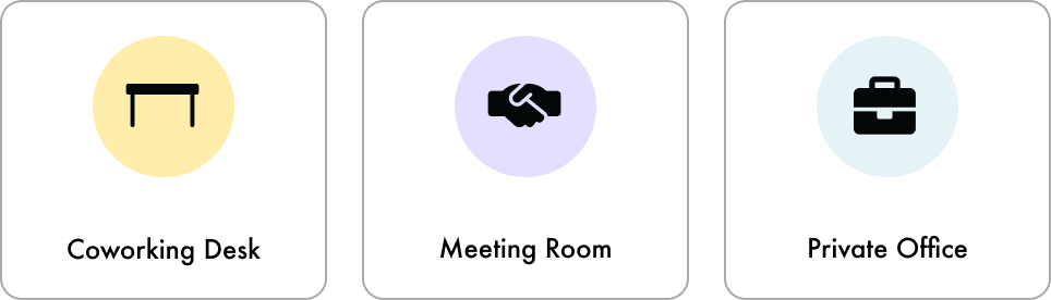
They offer individuals to book coworking desks, meeting rooms, and private offices in any location in Ontario.
My role
I was the only product designer for this project, working with 1 product manager and 4 developers.
Within this project, I worked closely with the product manager to understand the clients' problems, business goals and created user flows, analysis of their current product, competitive research, usability testing, at the same time connecting with the devs to understand technical constraints as well.
The problem
During COVID-19, many businesses transitioned to remote work, leaving leased office spaces unused while still incurring costs.
Flexday saw an opportunity to address this by helping businesses rent out their unused desks, meeting rooms, and office spaces in the B2B (business-to-business) market.
However, Flexday’s existing Android and iOS apps were designed for individual users, not for teams. This created challenges for businesses, as the app lacked features for group bookings. To address this, Flexday partnered with Rangle to redesign the app for better team coordination and collaboration.
However, Flexday’s existing Android and iOS apps were designed for individual users, not for teams. This created challenges for businesses, as the app lacked features for group bookings. To address this, Flexday partnered with Rangle to redesign the app for better team coordination and collaboration.
Our goal
Our goal was to achieve a 10% increase in team bookings for meeting rooms and office space to maximize revenue.
By adding features that support B2B teams in finding, booking and coordinating coworking spaces, we aim to enhance the user experience and expand Flexday's market reach. This goal is crucial because the revenue potential in team bookings is substantial compared to individual coworking desk reservations. By focusing on this high-value segment, we aim to capture a larger share of revenue generated from these lucrative transactions.
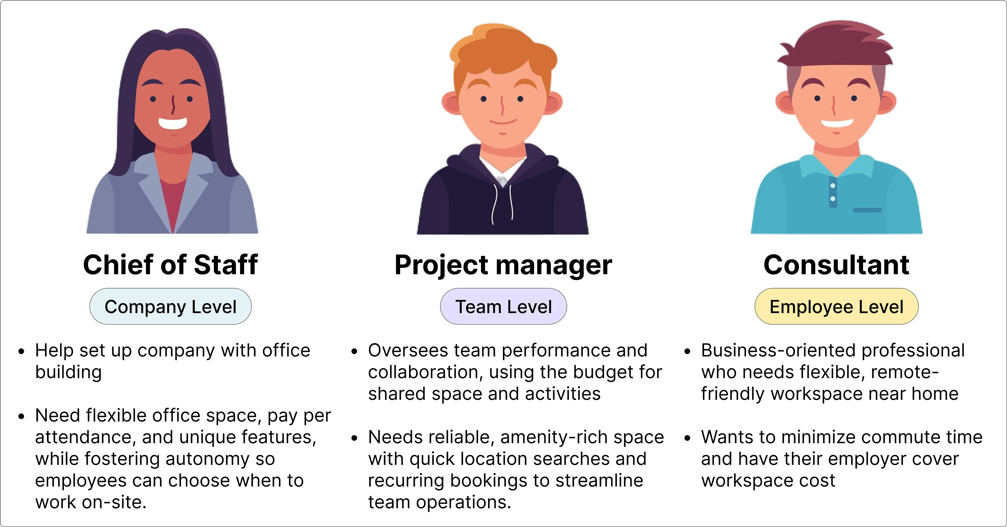
Understanding the users needs
We needed to create user personas to inform and align design solutions with B2B needs.
We needed to create user personas to inform and align design solutions with B2B needs.
At this step, we focused on identifying the core user personas to understand the problems and needs of Flexday’s B2B users. This step is essential for developing user journeys that will guide our design solutions and ensure they address the real challenges faced by teams.
Creating these personas also enhances my communication with the client. When discussing design solutions, I can reference specific pain points or needs identified in our persona mapping, explaining how each design choice addresses these issues and meets user needs. Additionally, having detailed user personas streamlines discussions, saving time and making it easier to justify why certain design solutions are more recommended. This approach ensures our solutions are well-informed, directly aligned with user requirements, and leads to more impactful and relevant design outcomes.
Understanding the existing front-end experience
To guide our UX improvements, I began by assessing the current state of the front-end experience.
I conducted a thorough analysis of the app's user flow, mapping out user funnels and evaluating the technical setup. This step was crucial for identifying key issues with the existing design and gaining a complete picture of the user experience.
By analyzing the current user flows and screens, it helps me pinpoint specific areas for enhancement. This also allows me to bring these issues to the product manager where we are able understand which features needs to be prioritized to improve and why, and discuss it with the client, who would make the final decision.
This analysis not only highlights challenges and opportunities for improvement but also provides a clear rationale for design changes. Presenting these findings will streamline discussions, ensuring our UX improvements will be impactful.
This analysis not only highlights challenges and opportunities for improvement but also provides a clear rationale for design changes. Presenting these findings will streamline discussions, ensuring our UX improvements will be impactful.
❌ The onboarding relied heavily on text, making it unclear what the application offers at first glance.
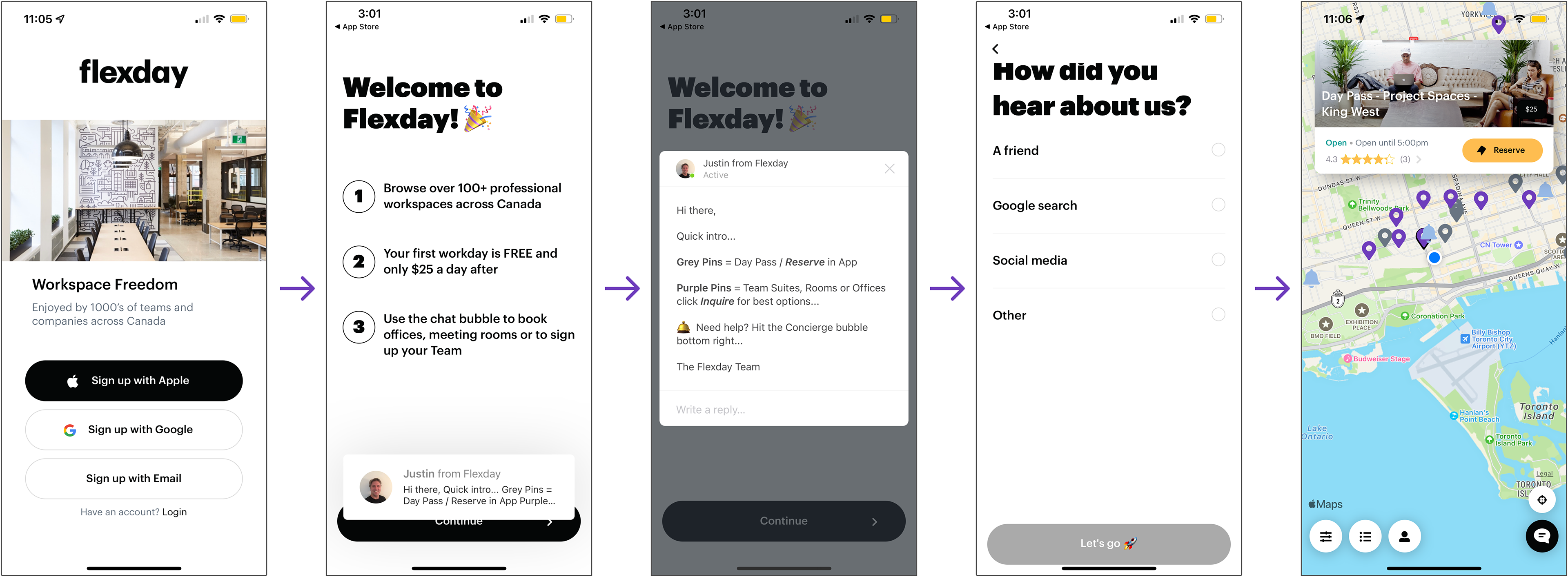
The onboarding required users to click through several screens to reach its main feature (sign in screens are not shown in the image).
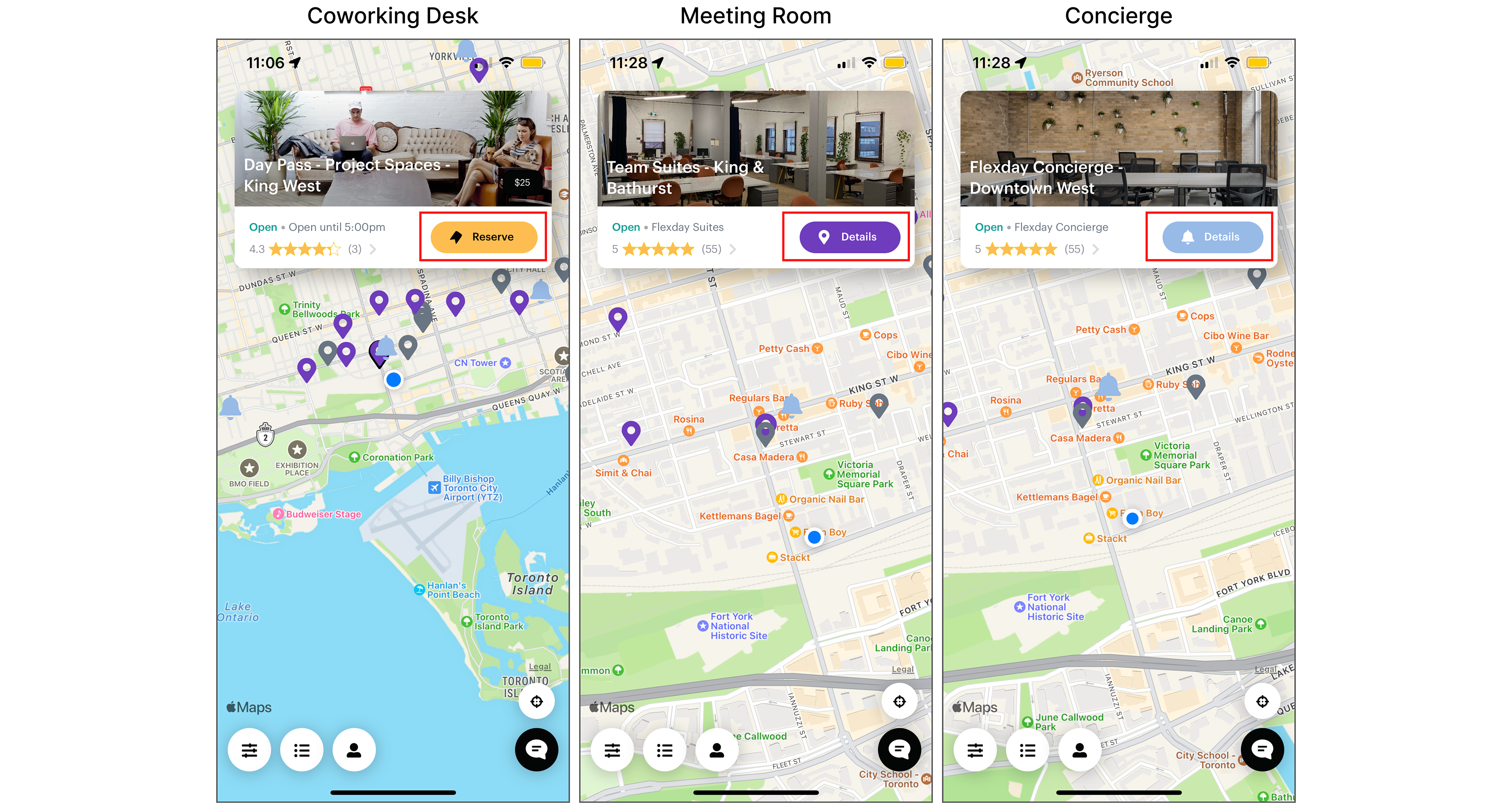
❌ Map pins don't clearly distinguish between coworking desks, meeting rooms, and office space.

❌ Flexday aimed to boost meeting rooms and office space bookings, but these features lacked a strong call to action. Their buttons are labelled "details", unlike the more compelling "reserve" label for coworking spaces
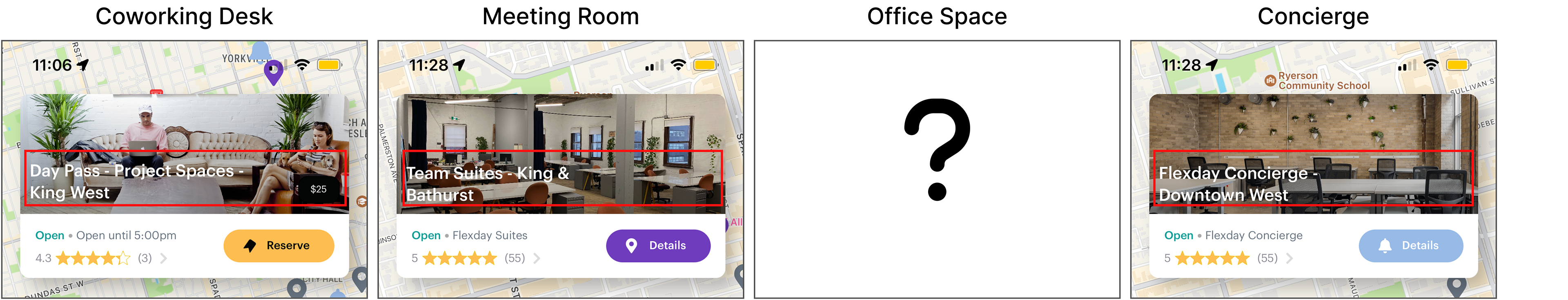
❌ Text is inaccessible and unclear about the day pass, team suites, and concierge, making their value unclear. It is also not obvious that meeting rooms are available or that you need to connect with the concierge to book one.
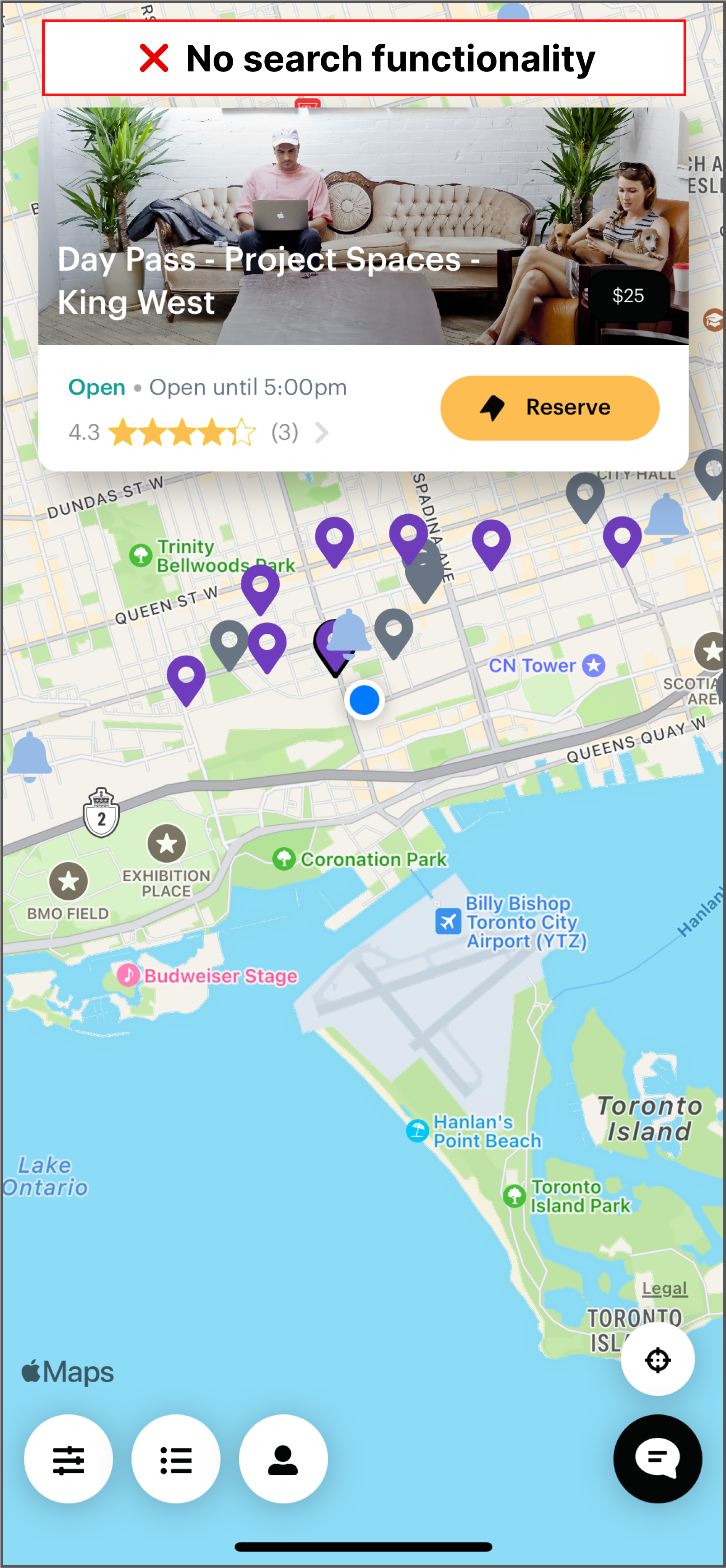
❌ No location search makes users manually drag the map, leading to missed opportunities and impacting business.
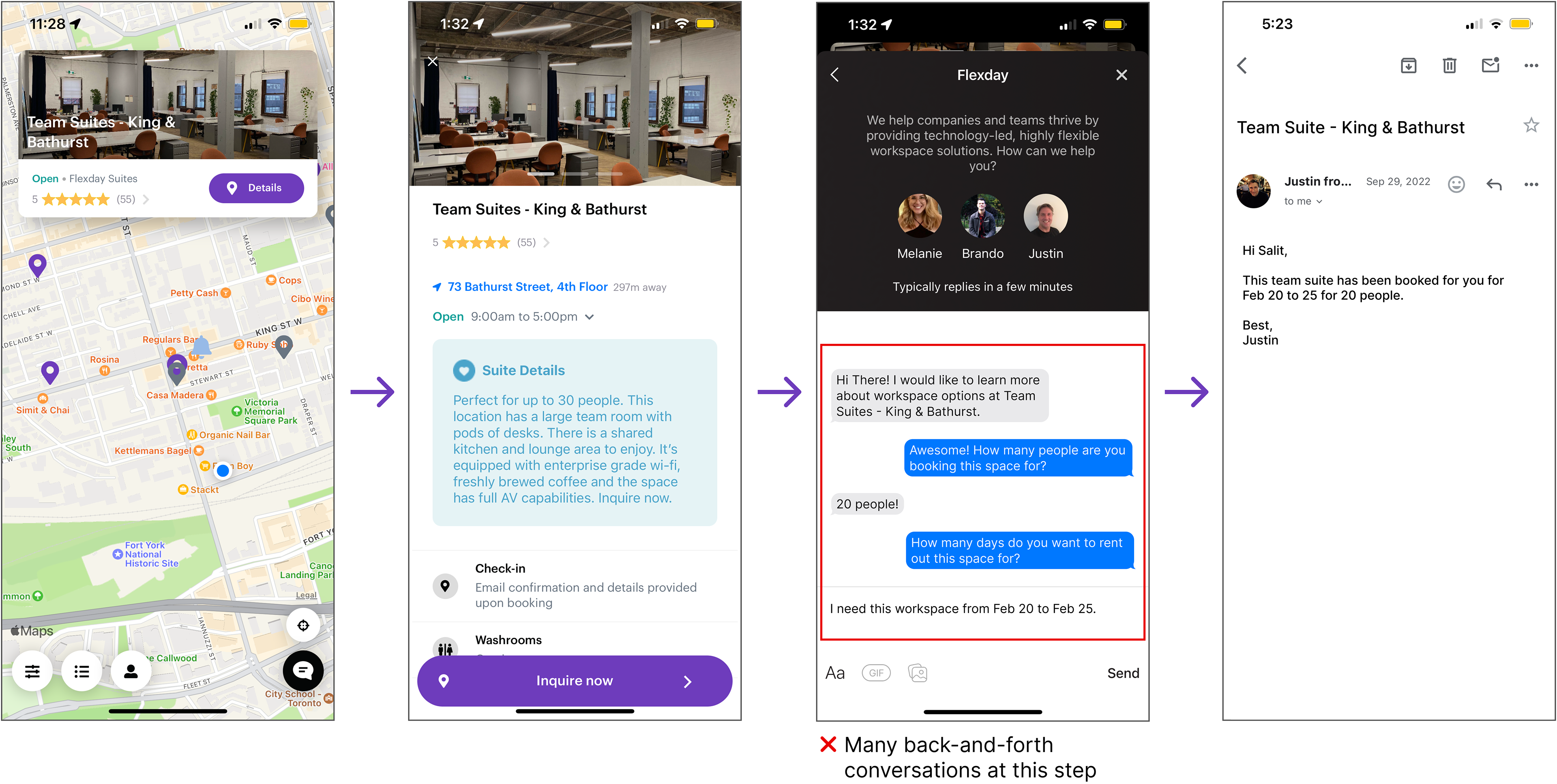
Client's pain points
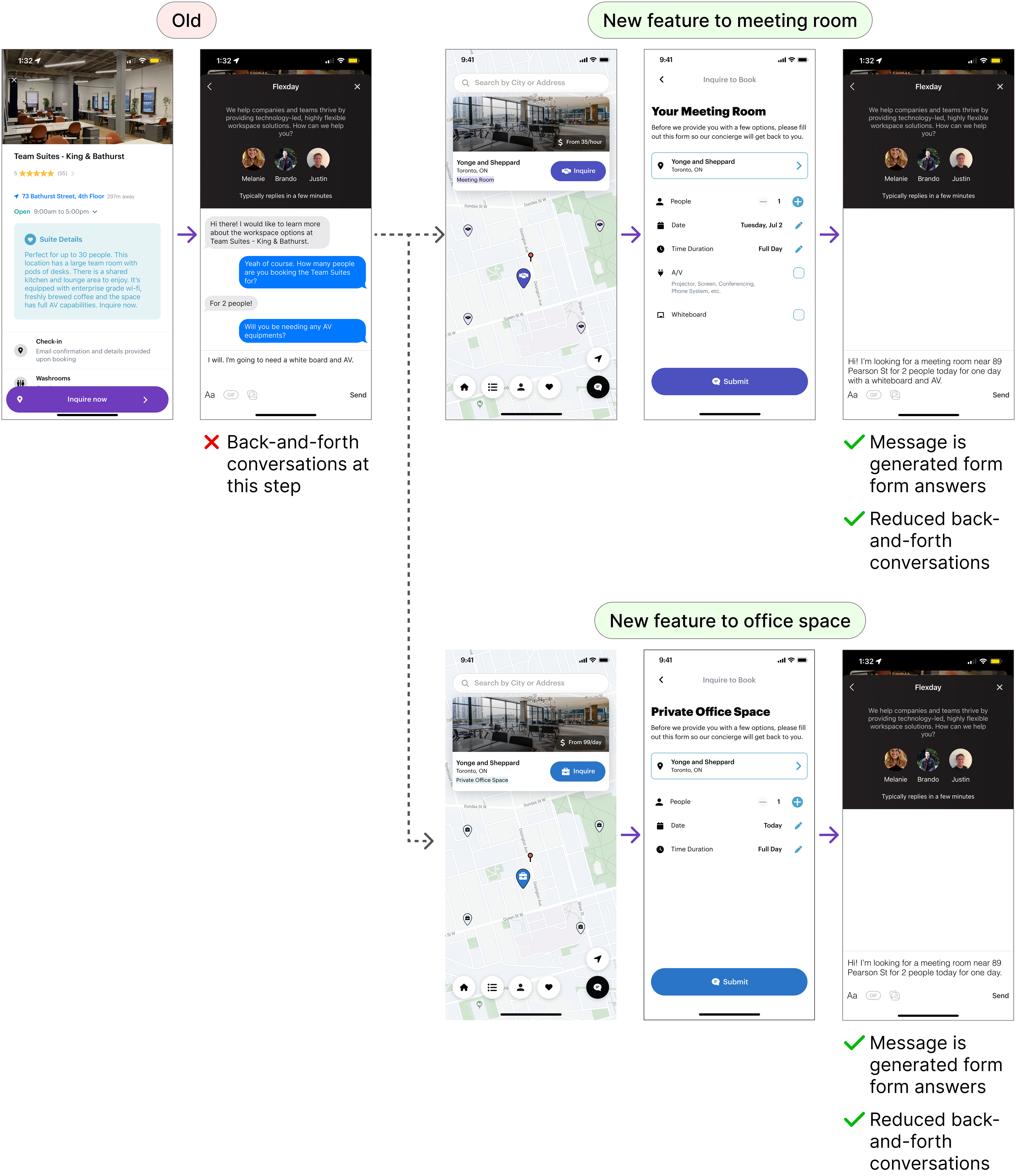
Inefficient booking process for meeting rooms and office space requires concierge assistance and back-and-forth communication to determine user preferences.
The client’s pain point is that users must contact the concierge via intercom to book meeting rooms or office spaces because the Flexday system lacks integration with the landlord's building schedule. This process is inefficient and involves excessive back-and-forth communication. The client seeks a solution where users can fill out a short form with details (e.g., number of people, required amenities) that automatically populates the chat, allowing the concierge to quickly match and offer room options.
Feature Requirements
App's analytics confirmed key issues identified in customer interviews, validating focus on solving these critical problems for maximum user value.
Based on the app’s analytics (as maintained in Amplitude), our team was able to correlate certain problems that we’d identified during customer interviews. This knowledge increased our confidence in what we believed would be the most important problems to solve that could have the highest impact on value creation for the end user.We prioritized the following features:
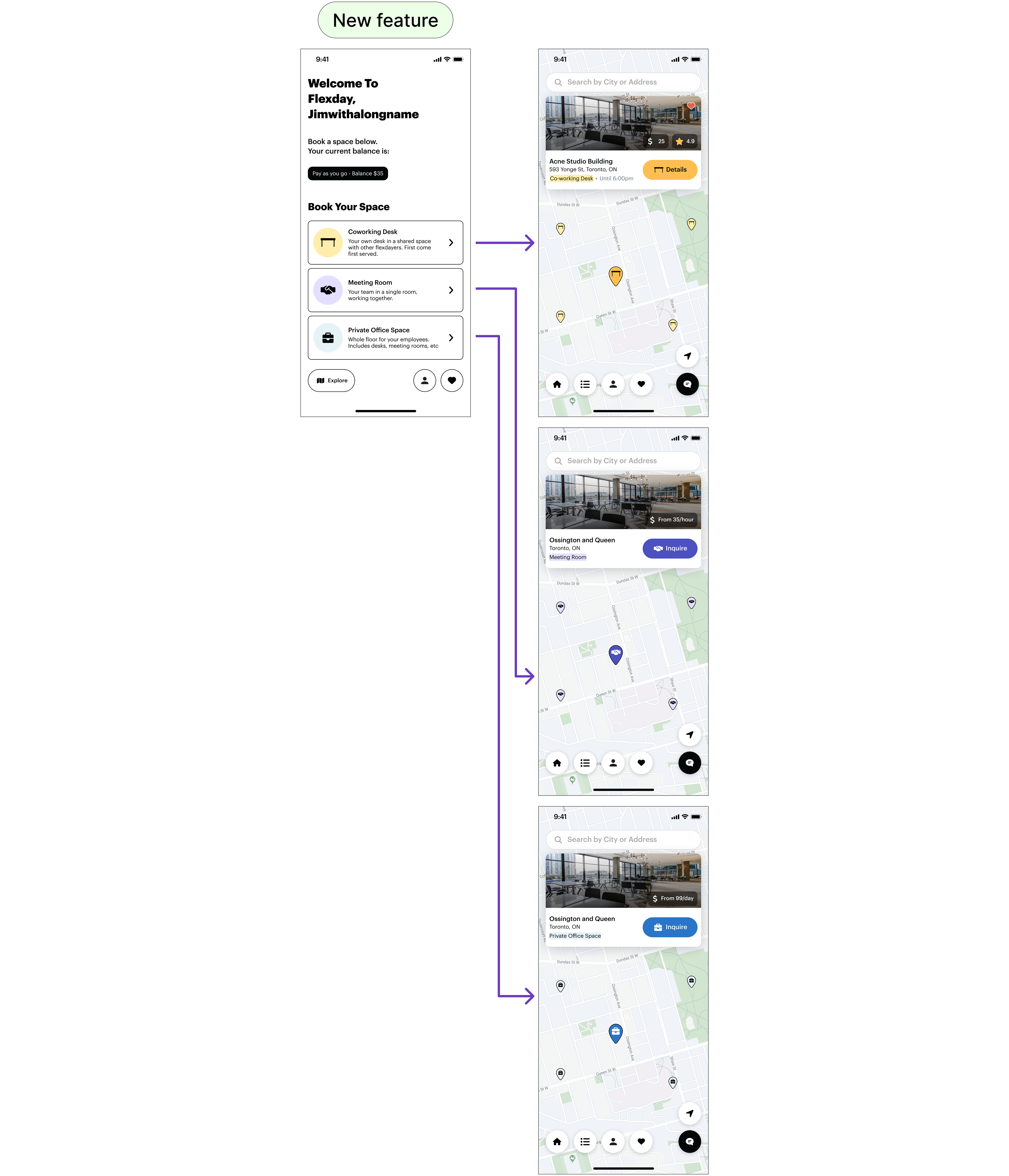
1. Search location
2. New homepage navigation with check-in flow
3. Flexday concierge questionnaire
4. Favourite and rebook coworking spaces
5. Updated login/registration page
Over 2.5 months, we delivered 3-4 small, iterative releases to complete these features.
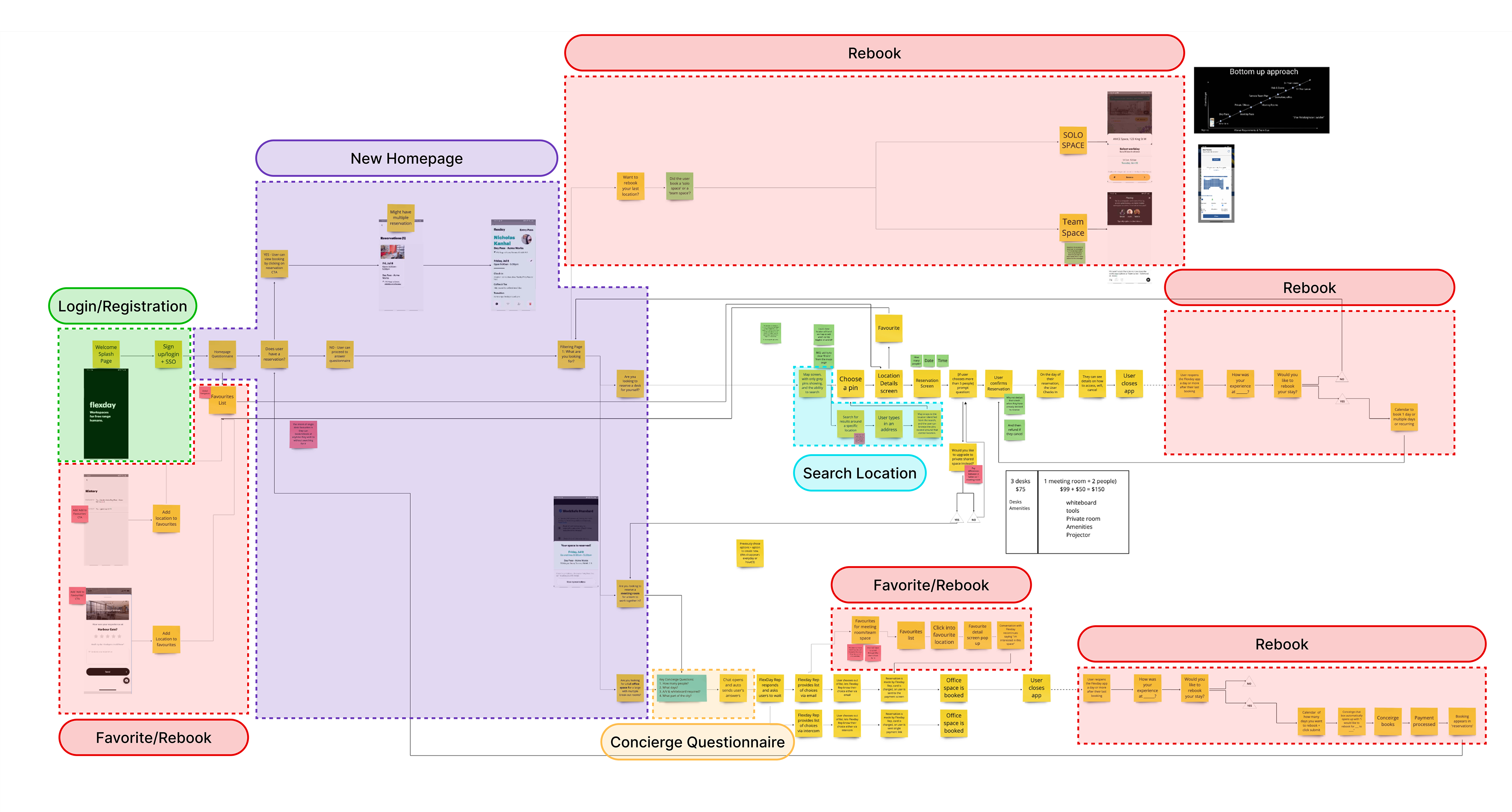
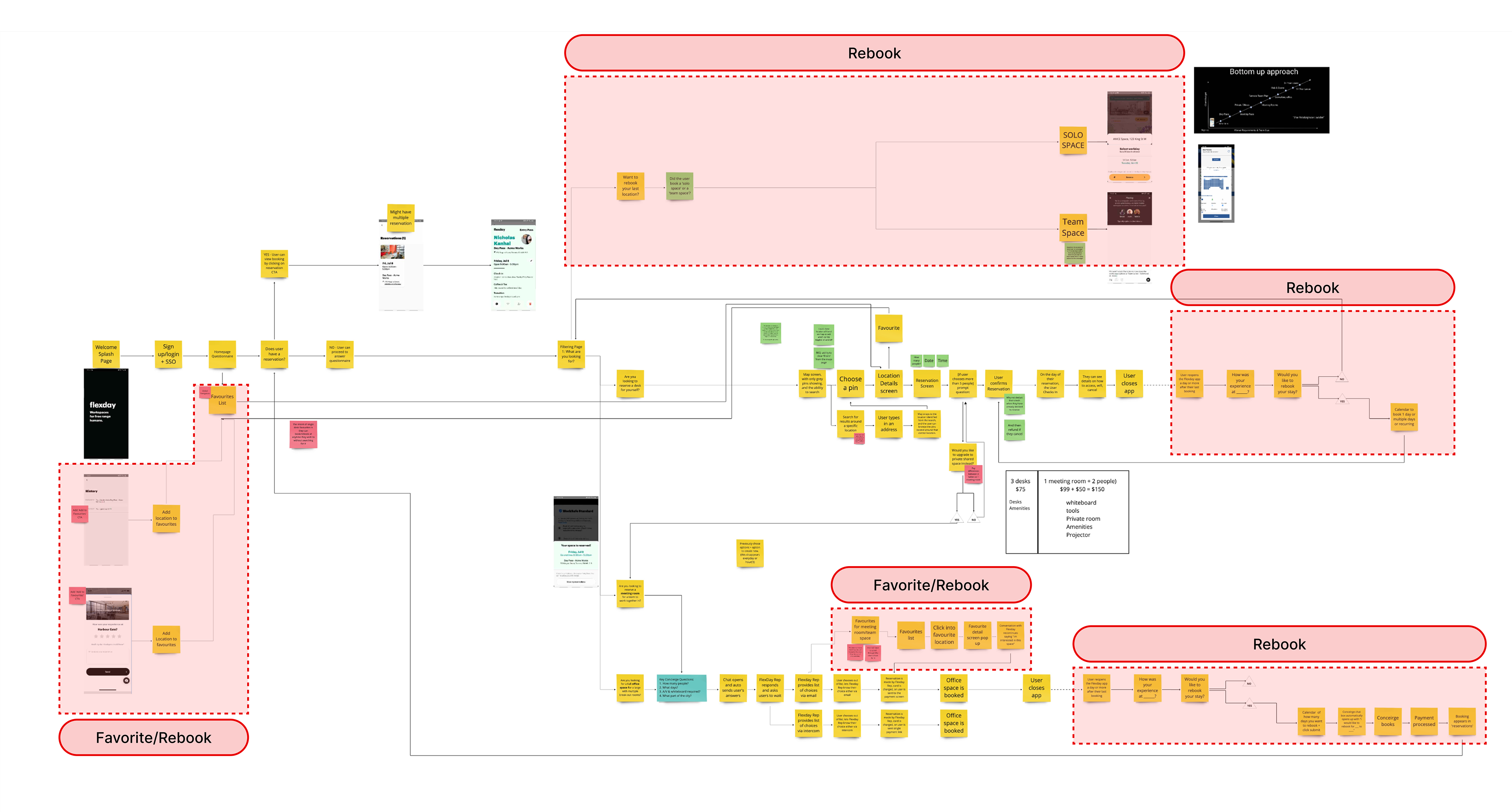
User mapping
After prioritizing features, I used user mapping to visualize their integration with the current application, ensuring seamless interaction with the current design.
User mapping helped me create a comprehensive visualization of user journeys, showing how users would navigate and utilize both new and existing features. This approach was essential for identifying potential challenges, optimizing workflows, and enhancing overall usability. By providing a 'big picture' view, user mapping ensured that when I began designing the screens, they would integrate seamlessly into the existing flow and achieve the user impact we aimed for.
Search location
We aimed to improve office discovery by implementing a search by location feature, replacing the inefficient screen-dragging method.
Within Flexday, this enhancement was crucial for improving user experience. Previously, users could only view available offices by manually dragging the screen, which often led to missed opportunities to find suitable nearby offices. Introducing the search by location feature significantly improved accessibility, enabling users to quickly and easily find offices in their desired area.
When creating this 'search location' feature, I took a lot of my inspiration from Google Maps.
I took inspiration for the search location feature from Google Maps, as they have conducted extensive research on maps and user navigation. Additionally, the majority of North Americans use Google Maps as their primary navigation tool, making it a familiar reference point.
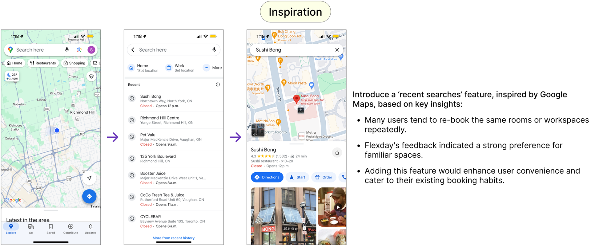
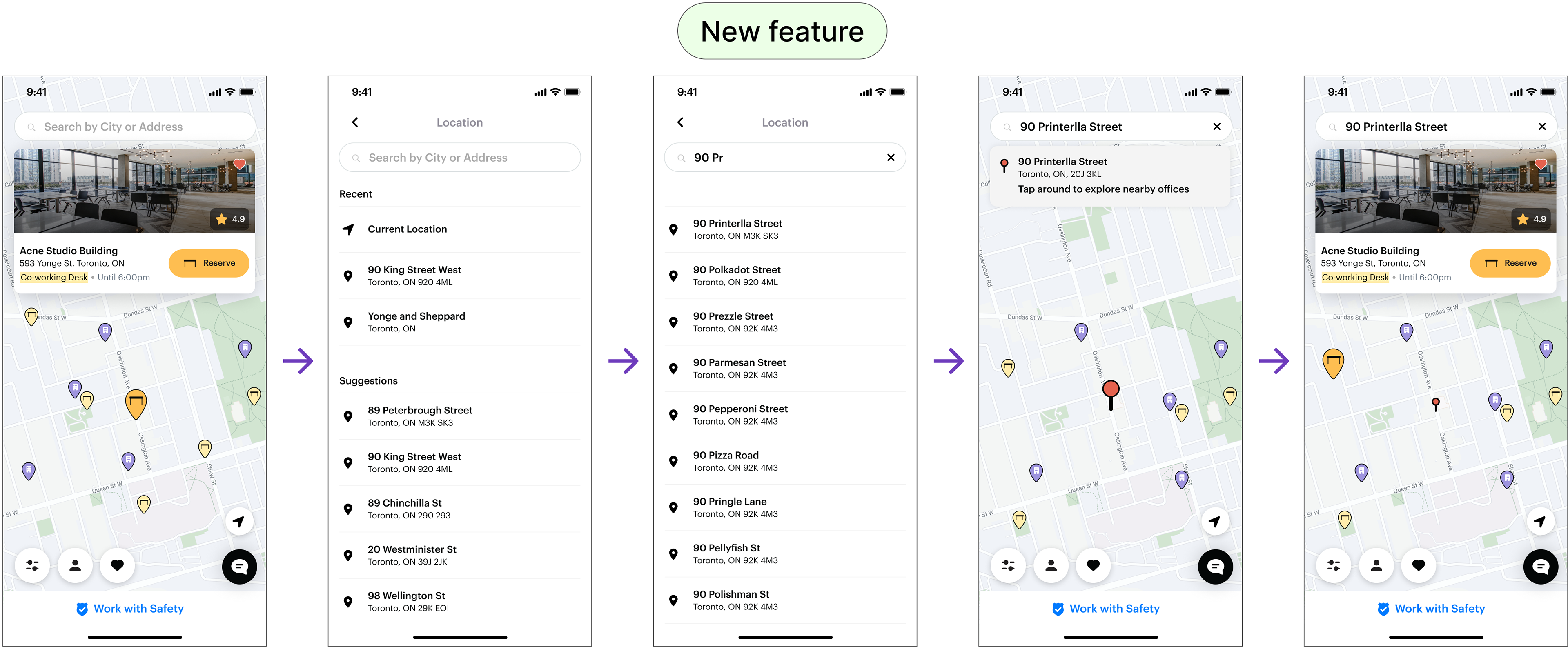
At this phase, I was only focused on the location search and not so much of the individual map pins yet. The icons and color were still 'to be determined' due to us having limitations to only Font Awesome icons.
New homepage navigation
I designed and implemented a new homepage navigation to clearly showcase Flexday's offerings, enhancing user clarity.
Emphasizing clear homepage navigation is crucial, because it ensures users can quickly find and understand Flexday's features, enhancing their overall experience and reducing frustration.
Inspired by Disney Plus, Expedia, and Skyscanner, Flexday's app uses clear buttons to instantly show workspace options.
Inspired by Disney Plus, Expedia, and Skyscanner, Flexday's app uses clear buttons to instantly show workspace options.
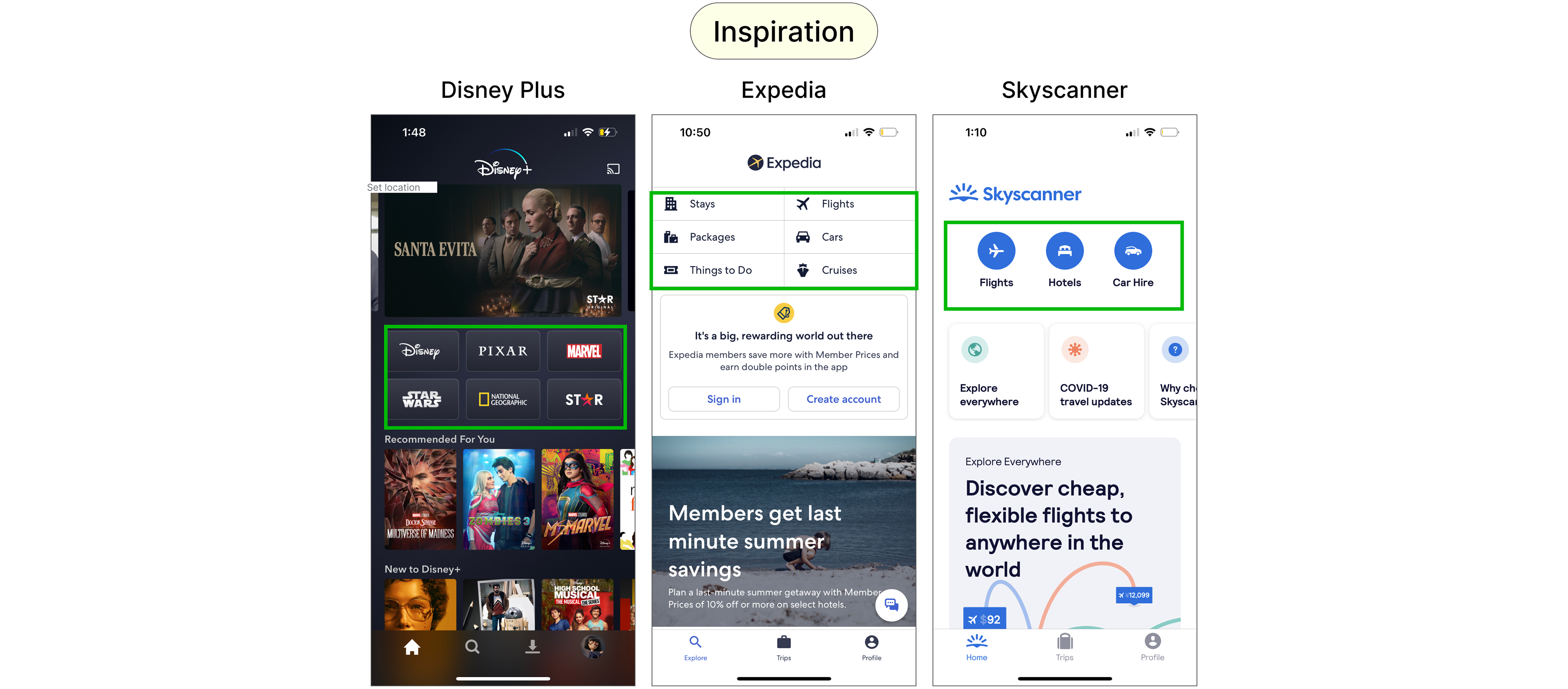
The common thread between the 3 is that users don't have to figure out what these sites offer—the buttons make it immediately clear. This inspired my design for Flexday's mobile app, where buttons for coworking space, meeting rooms, and office space allow users to quickly understand their options without reading text.
The new homepage cut down on text and steps, making it easier for users to see available options and quickly access the map feature.

Previously, users faced multiple steps and lengthy text to grasp Flexday's co-working options. With the homepage, we simplified the navigation, reduced text, and relied on the application itself to convey information more effectively.
Adding check-in to the homepage navigation
Following the location search update, I moved the 'Check-In' and 'View Upcoming Reservation' alerts to the homepage for improved visibility.
Previously, users faced multiple steps and lengthy text to grasp Flexday's co-working options. To streamline this, we simplified the navigation, reduced text, and relied on the application itself to convey information more effectively.
Previously, users faced multiple steps and lengthy text to grasp Flexday's co-working options. To streamline this, we simplified the navigation, reduced text, and relied on the application itself to convey information more effectively.
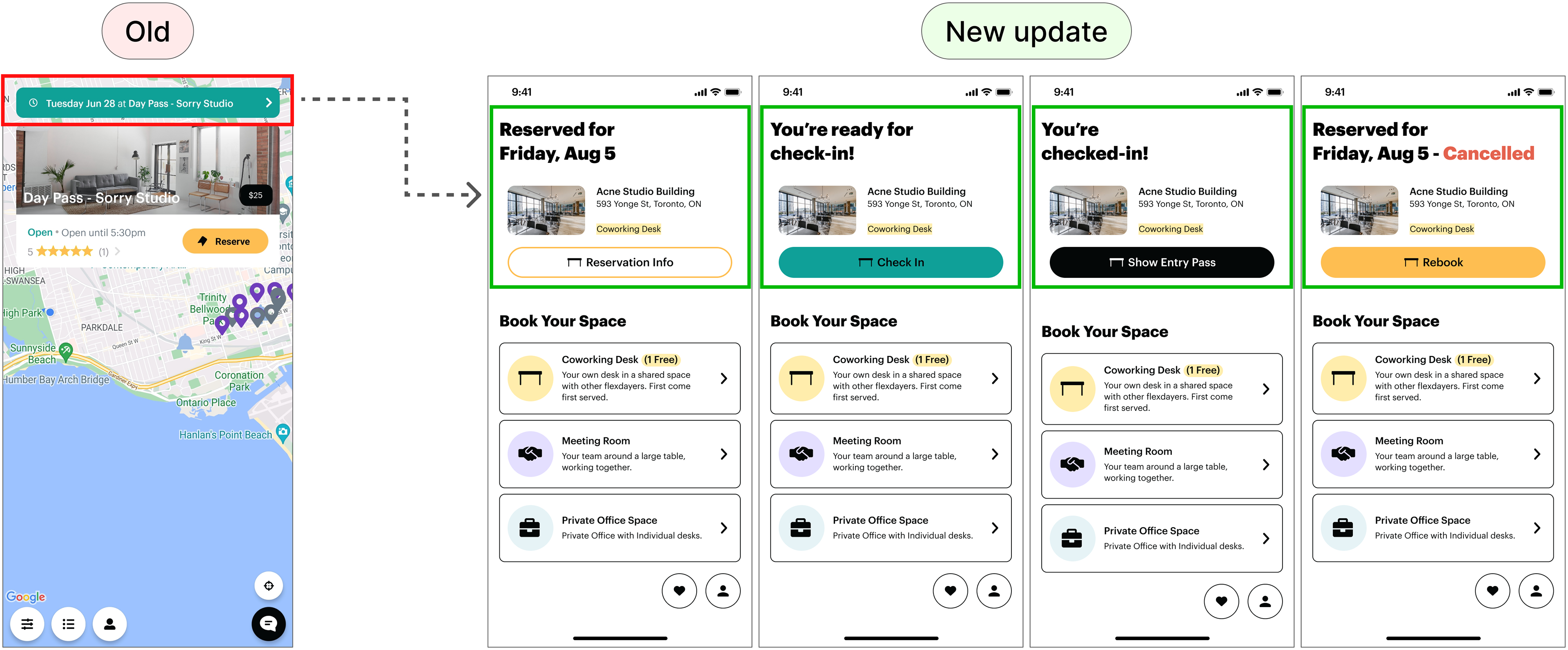
This update allows us to clearly show the different states of the booked workspace and emphasize key actions, such as check-in, by featuring them prominently on the homepage.
Flexday concierge questionnaire
To streamline the booking process, we introduced a form to reduce the back-and-forth communication between the concierge and the user.
We designed a questionnaire for room booking inquiries to collect essential details -- like the number of people, required A/V equipment, location, duration, and date. This reduces back-and-forth with the concierge and allows Flexday to quickly provide optimal booking options, streamlining the user experience.
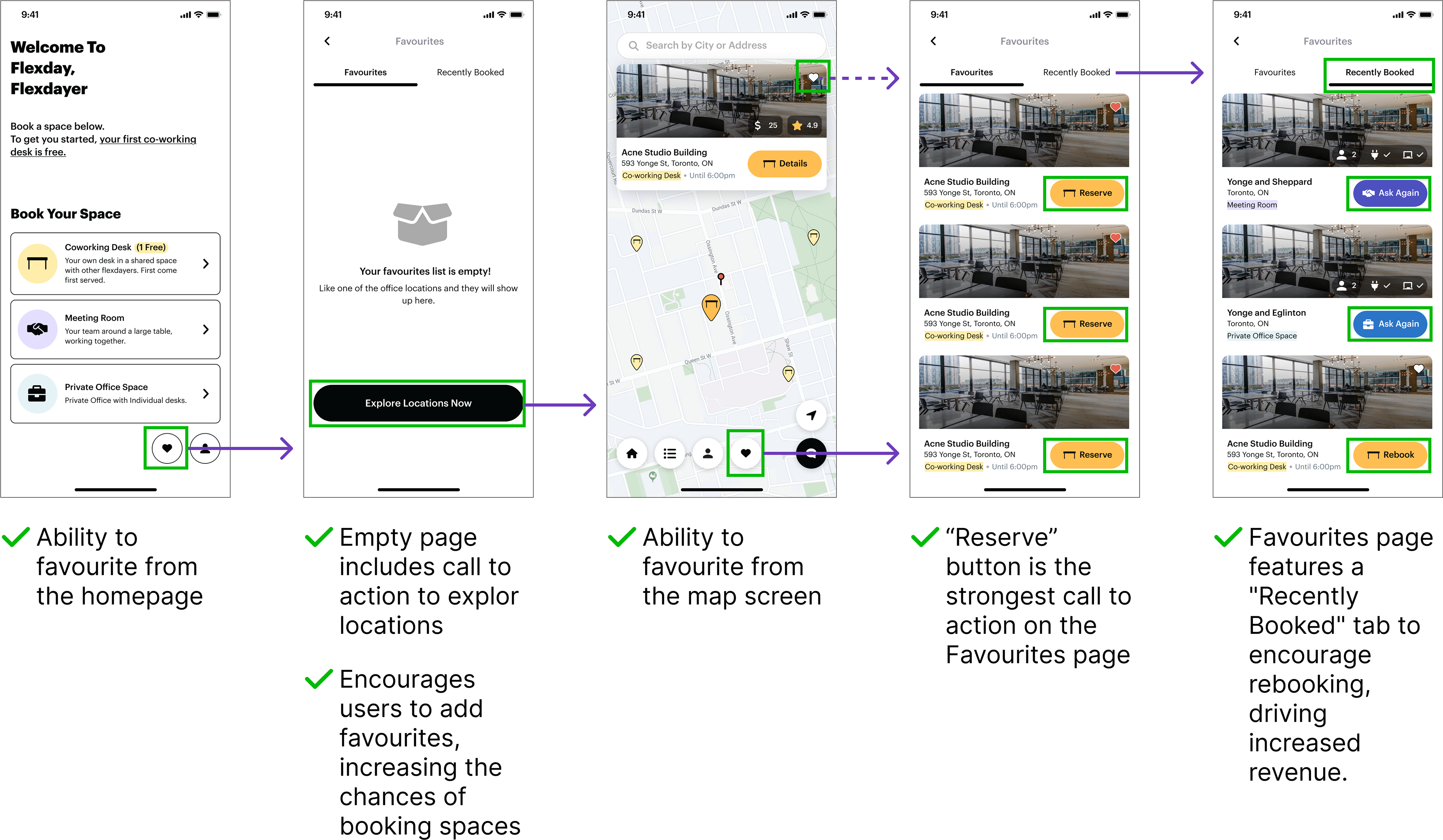
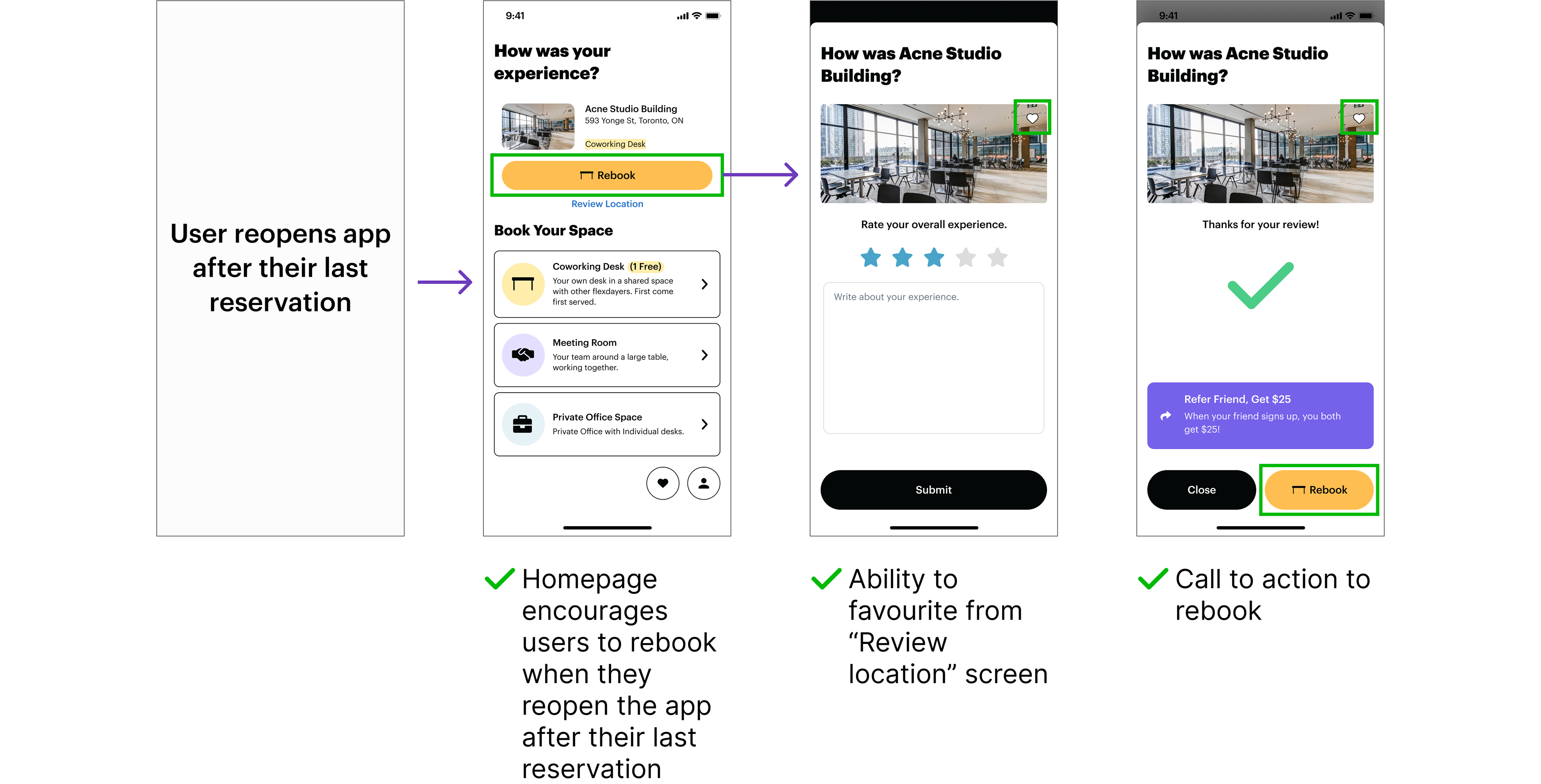
Favourite and rebook coworking spaces
I designed the 'Favourites' and 'Rebooking' features to boost retention by encouraging frequent rebooking of preferred coworking spaces.
I designed the 'Favourites' and 'Rebooking' features to boost retention by encouraging frequent rebooking of preferred coworking spaces.
To enhance user engagement and retention, we introduced the "Favourites" and "Rebooking" features into the Flexday app. By allowing users to mark coworking spaces as favourites and easily rebook them, we aimed to create a habit loop, encouraging users to repeatedly book their preferred spaces. Additionally, we incorporated a prompt that appeared when users reopened the app after their last reservation, asking if they would like to rebook the same space. This feature further streamlined the booking process and reinforced habitual use, ultimately driving greater user satisfaction and retention.
As shown below, 'Favourites' and 'Rebooking' is implemented throughout all stages of the user journey.

After mapping out all the flows, I proceeded to design the solution, resulting in the following features:


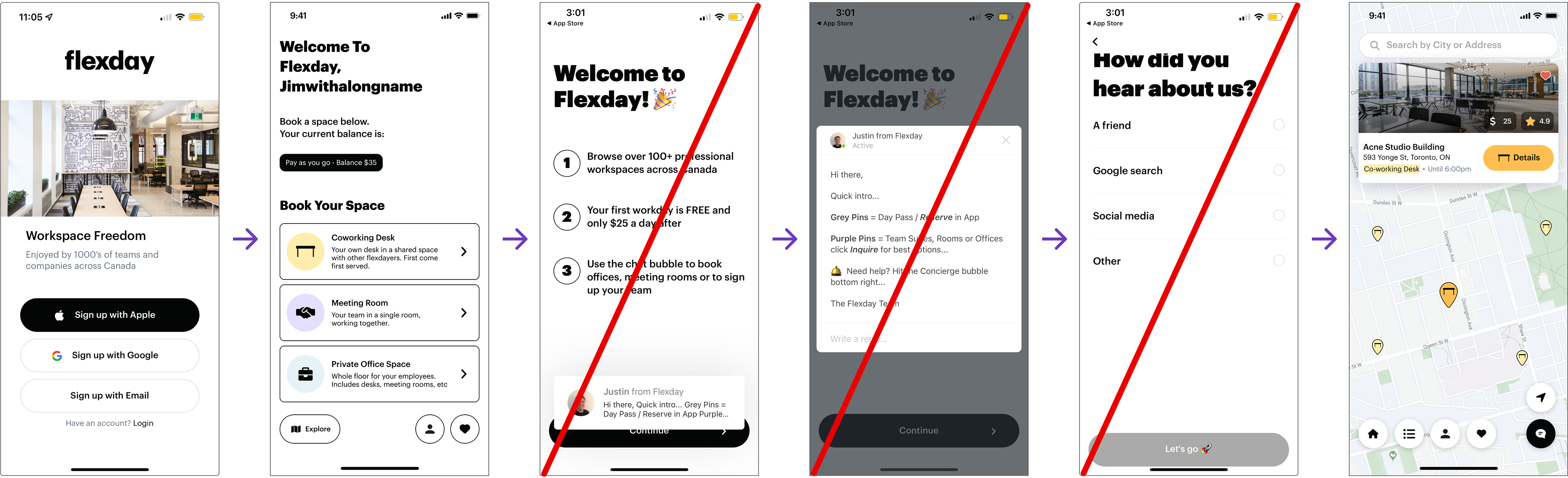
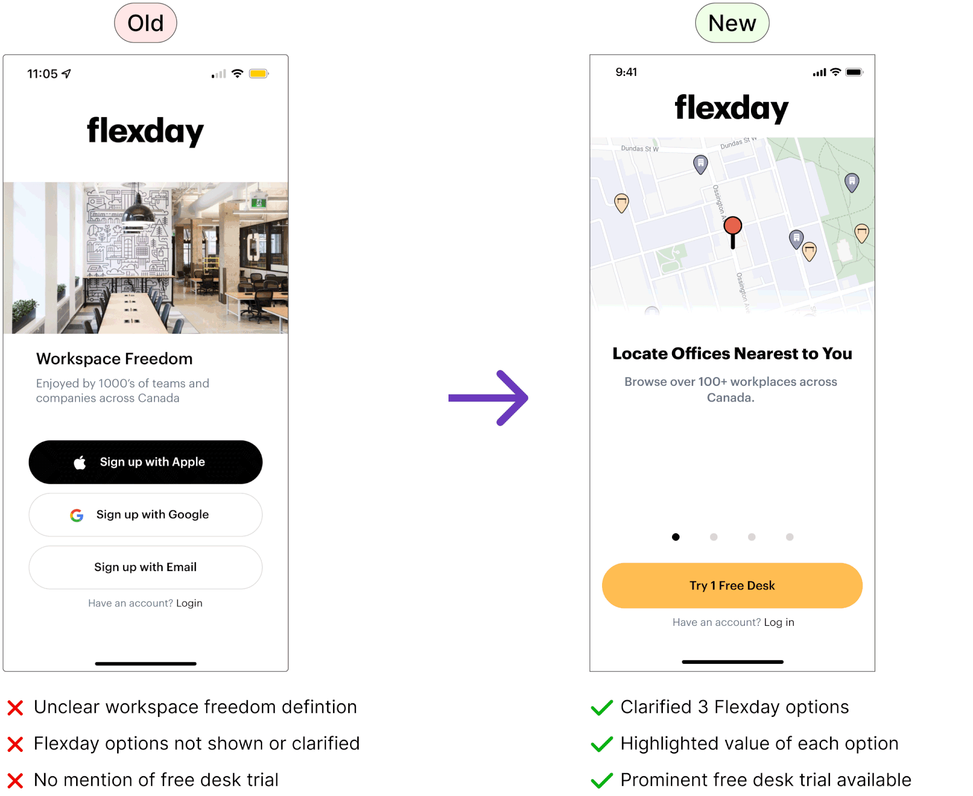
Updated login/registration page
I revamped the registration page to highlight Flexday's options and the free desk trial to encourage more signups.
The original registration page didn't clearly show Flexday's options or availability of a free desk trial. As a result, I revamped the page by highlighting the value and prices of the coworking spaces, and included a call-to-action button to try a free desk.
The outcome
The project successfully increased meeting rooms and office space bookings, leading Flexday to return for help with revamping their website to match the app's new design.
✅ Adding three visual options for coworking spaces on the homepage simplified navigation and boosted revenue.
✅ The new Concierge feature streamlined the booking process, reducing time spent on user preferences and conversations.
✅ The rebooking feature encouraged users to repeatedly book their favorite spaces, further driving revenue growth.
✅ The new Concierge feature streamlined the booking process, reducing time spent on user preferences and conversations.
✅ The rebooking feature encouraged users to repeatedly book their favorite spaces, further driving revenue growth.
The client was so pleased with the results that they returned a few months later for help revamping their website and increasing workspace bookings from their website. They also wrote a Medium article with the new feature enhancements we've added to the mobile application.
What Flexday said