
Role: Lead Product Designer
Timeline: 1 month
Platform: Desktop
Unbounce is a no-code platform that helps marketers and designers quickly build high-converting landing pages without developer support.
Our platform prioritizes ease of use, flexibility and functionality, giving users the tools they need to launch impactful marketing campaigns with minimal friction.
However, while our drag-and-drop builder offered creative freedom, users struggled with manually aligning page elements. This slowed down the design process and made it harder for them to produce polished, professional-looking landing pages. It became clear: we needed to make page building not just possible, but effortless.
However, while our drag-and-drop builder offered creative freedom, users struggled with manually aligning page elements. This slowed down the design process and made it harder for them to produce polished, professional-looking landing pages. It became clear: we needed to make page building not just possible, but effortless.
The Challenge
Our users were frustrated by manual alignment, slowing them down and creating inconsistent designs.
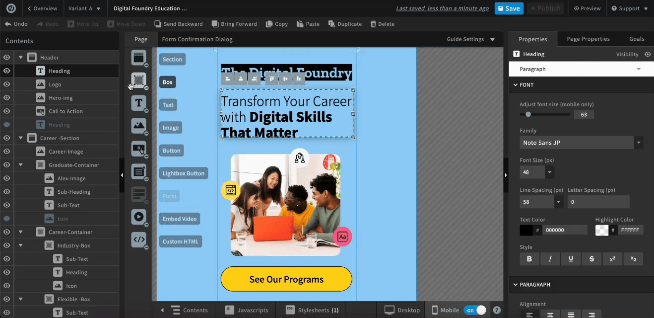
❌ Our web builder gave users no clear way to align content and measure the distance between elements, leading to frustration, extra work, and less polished designs, as shown in the video below:
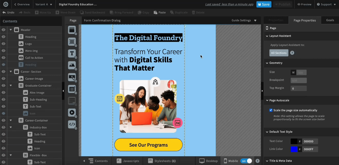
Users had to drag "box" elements onto the page to manually measure their content.
❌ Example: Users would create a 16px box to measure 16px between a title and image. This created unnecessary steps, slowing them down from publishing.
The Opportunity
To address this, we introduced a "Sections Grid" feature to reduce design friction and improve layout precision.
This solution would help users align content effortlessly, save time, and create visually consistent landing page faster, ultimately boosting their confidence and enhancing the overall user experience.
User goals:
1. Align elements quickly and accurately
They want layouts that look professional without spending time nudging elements pixel by pixel.
They want layouts that look professional without spending time nudging elements pixel by pixel.
2. Save time during the design process
They need to ship campaigns fast, so anything that cuts repetitive alignment work is valuable.
They need to ship campaigns fast, so anything that cuts repetitive alignment work is valuable.
3. Create visually consistent landing pages
Consistency helps users build trust with their audience and feel confident in their designs.
Consistency helps users build trust with their audience and feel confident in their designs.
4. Maintain creative control
They don’t want the grid to feel restrictive. They should be able to override snapping when they want.
They don’t want the grid to feel restrictive. They should be able to override snapping when they want.
5. Feel confident and professional
The tool should feel like it’s helping them, not fighting them, boosting their confidence in the end result.
The tool should feel like it’s helping them, not fighting them, boosting their confidence in the end result.
My Role
I drove the end-to-end design, from user research and competitive analysis to post-launch validation.
I partnered closely with the Product Manager and Developers to balance user needs, creative flexibility, and technical feasibility within a legacy codebase.
Through iterative design, feasibility discussions, and QA, I delivered a polished solution that improved alignment speed, visual consistency, and user confidence.
Through iterative design, feasibility discussions, and QA, I delivered a polished solution that improved alignment speed, visual consistency, and user confidence.
Competitive Analysis
I studied leading web builders' grid capabilities to understand market parity, identify key functionality, and see how they solved alignment challenges similar to ours.
I evaluated features such as Snap-to-Grid, on/off toggles, grid customization, responsiveness, layering control, and ease of use. My goal was to uncover how other platforms solved alignment challenges similar to ours, identify effective patterns, and determine which approaches could be adapted or iterated on to meet our users’ needs. These insights would later inform my design for "Sections Grid" to help reduce manual alignment friction and improve visual consistency.
Squarespace and Figma grids inspired ideas for flexible solutions that guide placement without limiting creativity.
From Squarespace, I saw how an always-on, responsive grid can guide placement without interfering with the visual canvas, which inspired me to consider a system that supports alignment while staying intrusive.
From Figma, I learned the value of toggleable grids and flexible snapping, showing how giving users control over alignment can maintain consistency without restricting creativity.
These insights helped me identify core principles for a flexible, user-friendly grid system tailored to our users’ needs.
Instapage and Leadpages block-based layouts are too restrictive to use for our users.
They define a “grid” as a block-based layout, where elements must snap into predefined zones. This simplifies alignment but restricts flexibility and creative control. I didn’t use this approach as inspiration because our users rely on manual placement in Unbounce, freely positioning assets anywhere on the page. Adopting a block-based system would disrupt workflows and constrain designs, making it unsuitable for our users’ needs.
Created various options
Based on the findings, I created various options that I felt would work well with our users.

I played with a solution like Squarespace where users can have the ability to choose how many columns, vertical gap, and horizontal gap they want their grid to have.
I added the ability for users to snap elements to the grid, so when they place elements onto the page, they automatically align to the nearest grid unit. If the user adjusts the grid settings, the page elements dynamically resize to stay consistent with the updated grid.

I took inspiration from a solution like Figma's where users can can adjust their grid size.
I added the ability for users to snap page elements to the grid. When the grid settings are adjusted, the page elements automatically increase or decrease in size to fit the updated grid.

In this option, I played with a solution with columns. Users are able to adjust the column count, margin and gutter.
I introduced a column snapping feature, allowing users to align elements precisely to the columns. When the column layout changes, the elements automatically adjust in size to the updated settings.
User research
I ran user research on the 3 concepts to identify the "Sections Grid" experience that best fit our users' needs.
After designing and prototyping 3 options, I conducted user research with 11 respondents. Of the respondents, 8 had direct experience building landing pages, while 3 were senior leaders speaking on behalf of their team's experience.
Users preferred a grid like Squarespace's.
Users preferred a grid like Squarespace's.
This preference was due to its ease of use and flexible customization, offering both grid and column control in one system.
Users preferred setting the grid at the section level.
Users were split on whether the grid should be set at the page level or sectional level. However, several users emphasized the need for more flexibility with padding and margins, which was something a section-level grid would better support. Adding grid settings at the section level would give users greater control over layout customization.
Recommendation
Based on user feedback, I recommended proceeding with Option 1 (the flexible grid) due to its alignment with user preferences and adaptability to various workflows.
To maximize its impact, I proposed the following enhancements:
1. Ability to Toggle Grid Visibility: Enable users to turn the grid on/off
2. Snap-to-Grid Control: Allow users to toggle snap-to-grid on/off
3. Customization: Provide options for columns, gaps, margins, padding, and row count
4. Section-Level Grids: Implement grid settings at the section level for greater layout control
5. Overflow Content: Allow items to bleed off the page for design flexibility
Scoping the MVP
Scoped a feasible MVP by aligning user needs with product and engineering constraints.
After proposing these enhancements, I defined user-story requirements and collaborated with the Product Manager and developers to scope a focused MVP within one quarter.
We prioritized four core requirements that maximized user value while balancing product and engineering constraints.
We prioritized four core requirements that maximized user value while balancing product and engineering constraints.
1. Show/hide grid
2. Turn on/off for page elements to snap onto the grid
3. Flexibility to customize grid on individual sections
4. Ability to utilize the grid even when items are bleeding off the page
Design and implementation
After scoping the MVP, I translated the requirements into detailed Figma designs, including various use-case scenarios to ensure clarity for development.
I collaborated closely with the Product Manager and developers, incorporating their feedback to address technical constraints and refine the experience. This process resulted in a well-documented, user-centered design that was successfully developed and shipped, delivering the prioritized enhancements to users.
Shipped Features Overview
The following screenshots highlight the key features from the implemented MVP.
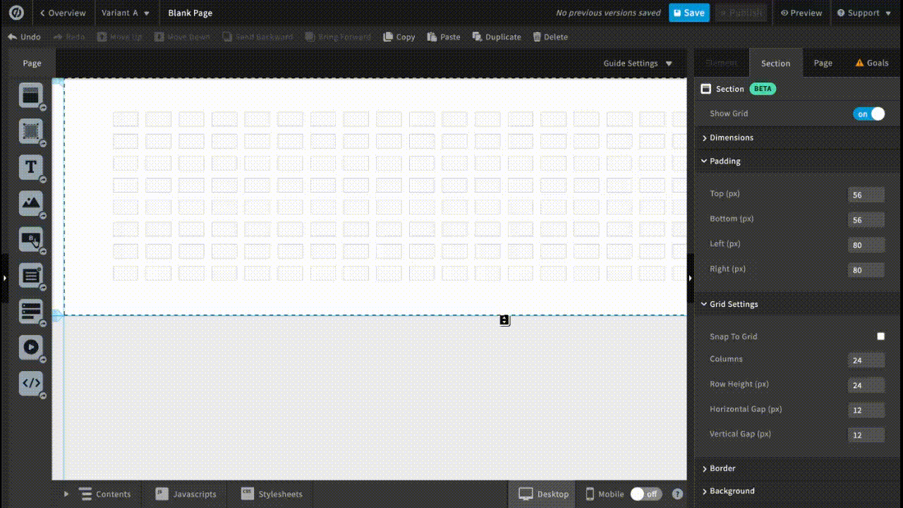
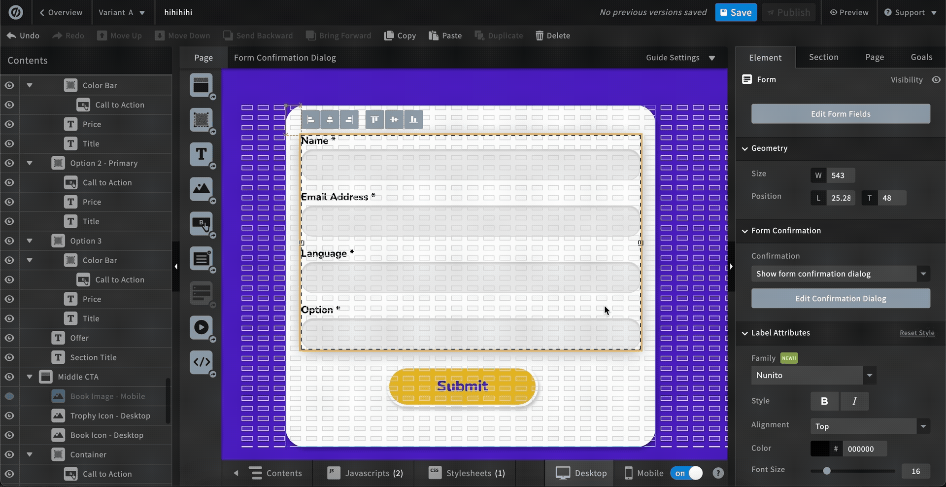
1. Sections Tab
Grid controls, including show/hide, padding adjustments, and grid settings, are located within this tab.
Grid controls, including show/hide, padding adjustments, and grid settings, are located within this tab.
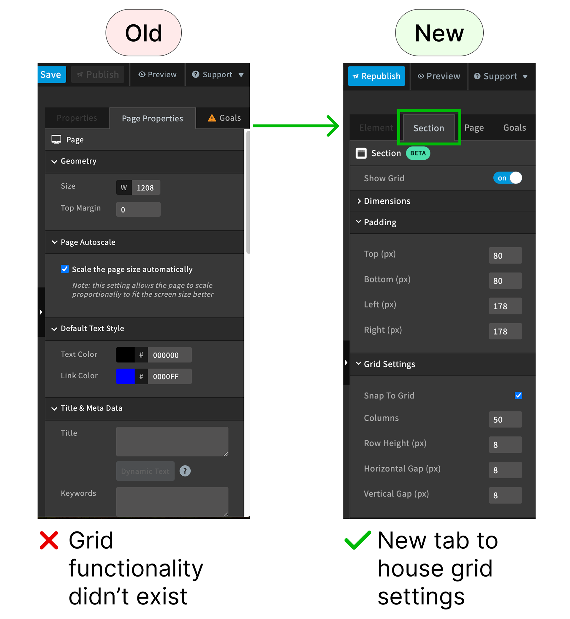
2. Padding Controls
Users can adjust the space above, below, and on either side of the grid within the selected section.
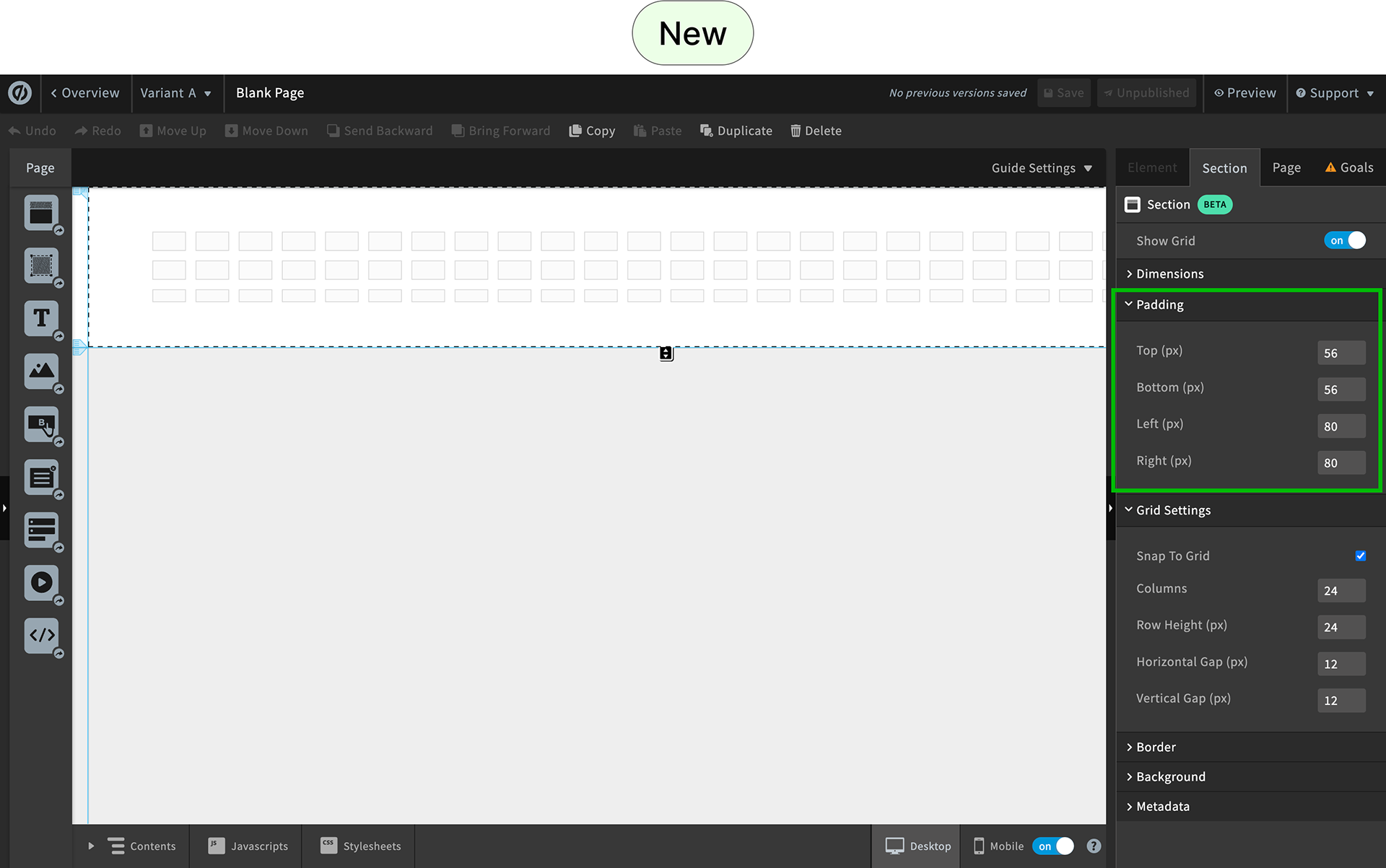
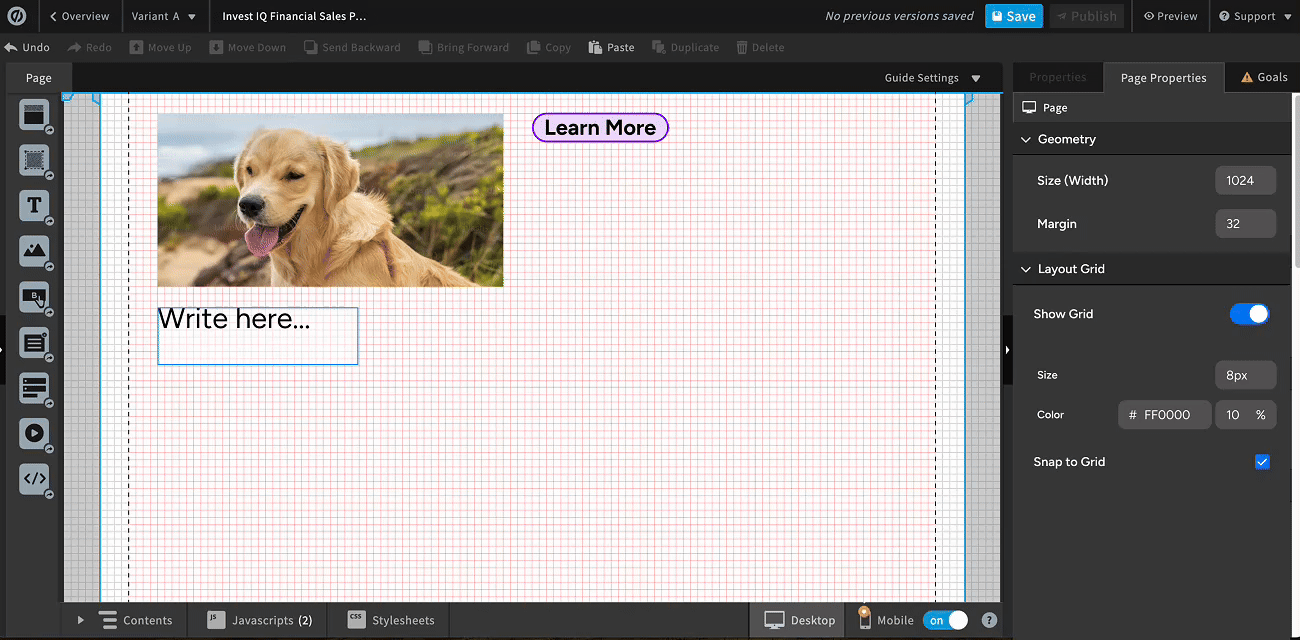
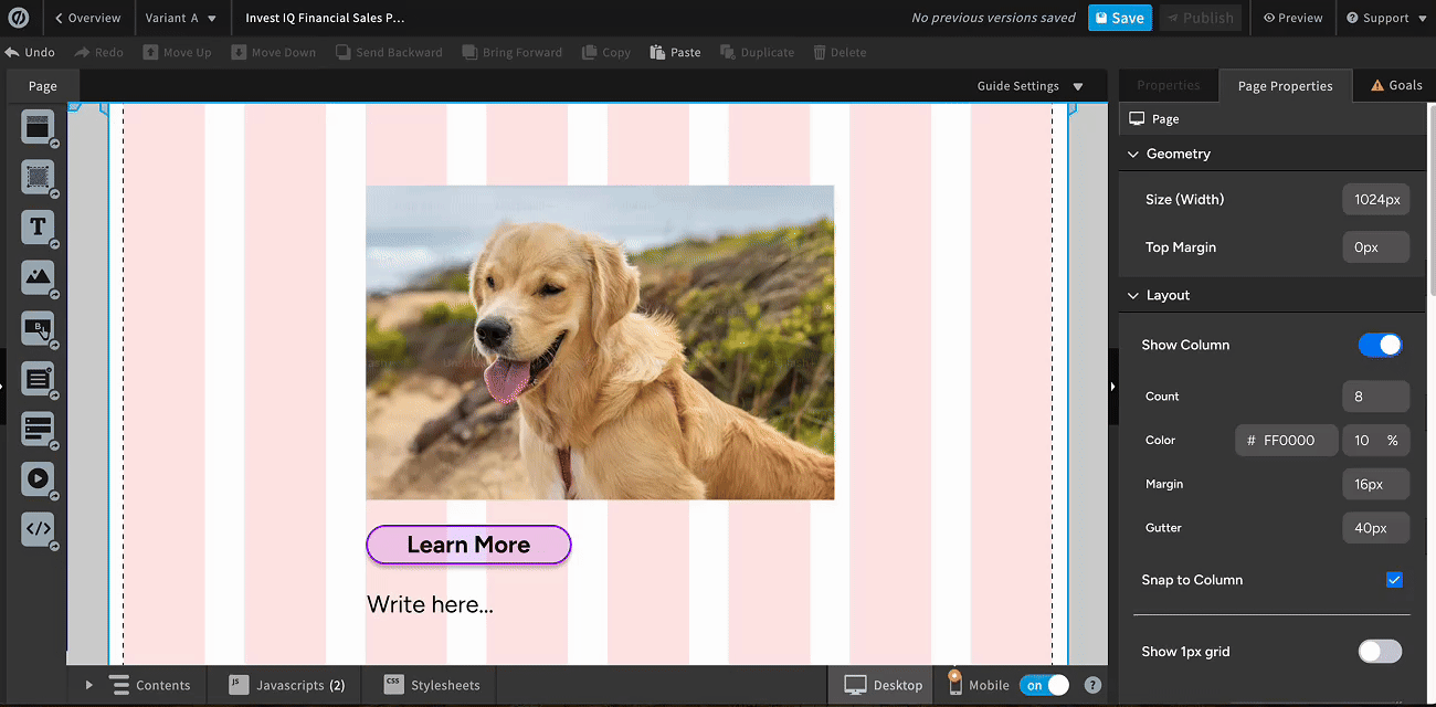
3. Grid Settings
Users can enable or disable snap-to-grid functionality and customize the grid’s dimensions and spacing.

Challenge
When designing the Sections Grid, I encountered a challenge with grid visibility due to legacy code and component structure.

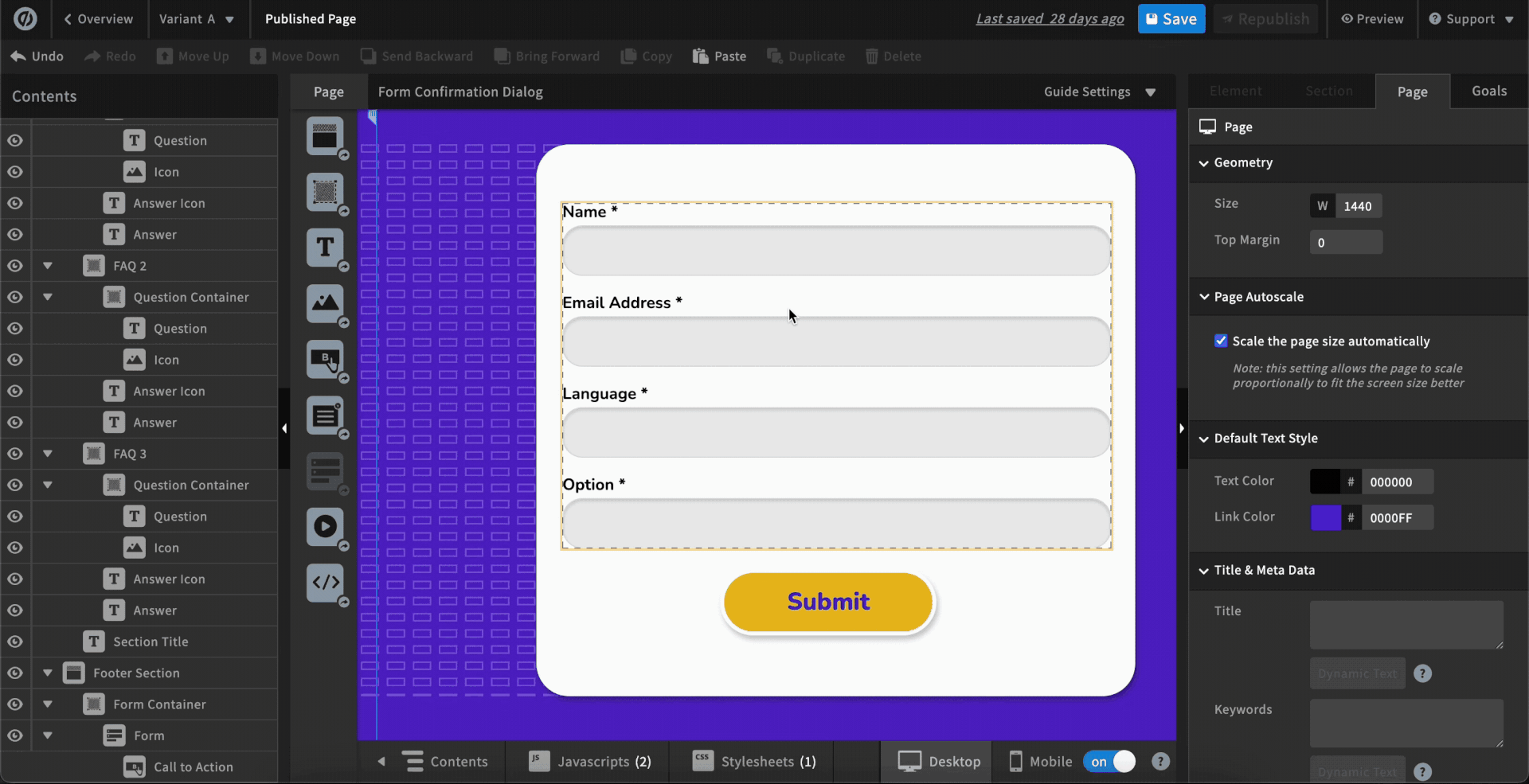

Normally, grids sit underneath elements, letting users see alignment guides while placing content. However, for components like forms and boxes, placing the grid underneath would hide it behind the element backgrounds, making precise alignment impossible.


To solve this, the grid was placed on top of elements, ensuring users could see guides and maintain precise placement. While not visually ideal, this approach balanced technical constraints with usability, keeping the feature functional and user-centered.
Impact and Learnings
Delivered the "Sections Grid" MVP and uncovered key user insights to drive the next iteration.
I designed and shipped the Sections Grid MVP within a single quarter, giving users a more consistent way to align and structure page content.
To validate the solution, I ran post-launch, task-based usability testing with new users.
Results showed clear efficiency gains:
Results showed clear efficiency gains:
✅ 64% reduction in task completion time (4:56 → 1:45) on identical alignment tasks
✅ 5/5 users preferred Sections Grid over manual alignment
To understand real-world adoption, I followed this with a post-launch survey of 91 existing Unbounce users. While users valued the added structure and alignment control, the results showed:
⚠️ Overall adoption remained low (2.31 / 5).
⚠️ Overall satisfaction with Sections Grid is mixed (2.8/5)
⚠️ Ease of using Section Grids is moderately easy (3.29/5)
Further analysis revealed that visual intrusiveness and limited grid visibility in certain contexts reduced usability for some users, impacting adoption despite strong task performance.
Key Takeaways:
Efficiency gains alone did not guarantee adoption.
✅ Users valued the added structure and alignment control.
⚠️ Visual intrusiveness led users to request adjustable grid opacity and color.
⚠️ Some users found the feature’s purpose unclear, highlighting the need for better onboarding.
⚡ Data showed a divide between users seeking precision and those prioritizing visual simplicity.
⚠️ Visual intrusiveness led users to request adjustable grid opacity and color.
⚠️ Some users found the feature’s purpose unclear, highlighting the need for better onboarding.
⚡ Data showed a divide between users seeking precision and those prioritizing visual simplicity.
These insights made it clear that improving visual comfort would have a greater immediate impact than expanding customization.
Revision Outcome:
Given limited development scope, I prioritized improving grid defaults setting over customization as a high-impact, low-cost intervention.
Adjusting the default grid color improved contrast across background types and reduced visual intrusiveness, addressing adoption pain points while preserving alignment efficiency.

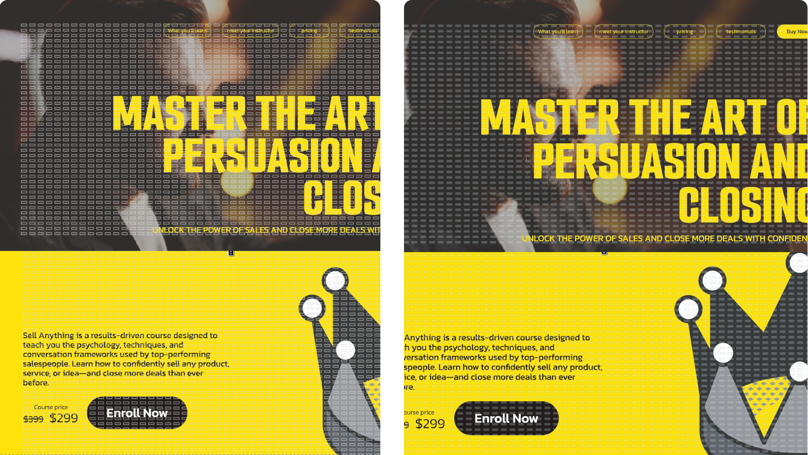
Results
This change reduced visual noise across varied backgrounds and improved usability without introducing additional complexity.